This styleguide has two purposes. First, I hope to make more apparent the decisions I’ve made for anyone coming behind me and looking to learn. I’ve benefited from other designers who took the time to “show their work.” Good design is 99% invisible, and when anything is designed well, we often fail to notice why the pieces work together. This guide deconstructs my decisions to make those why’s more apparent.
My second motive is a bit more selfish (and may turn out to be the primary motive). The best way to learn anything deeply is to teach it. I’m experimenting with building a design system spanning multiple brands, while also learning a few new platforms and toolsets. “Teaching” turns out to be a guise for loving something deeply and wanting to understand it better.
Typography
The primary fonts in this design system are Minion 3 Caption and Myriad Pro.
Minion (Minion 3 Caption)
ABCDEFGHIJKLMNOPQRSTUVWXYZ
abcdefghijklmnopqurstuvwxyz 0123456789
Minion is a contemporary type family created by Robert Slimbach and released by Adobe Originals.
Minion is a fully developed neohumanist text family which is, in the typographic sense, especially economical to set. That is to say that it gives, size for size, a few more characters per line than most text faces without appearing squished or compressed.
Robert Bringhurst, The Elements of Typographic Style (v.3.0)
Minion 3 is available in four optical sizes — Display, Caption, Subhead, and Text — each with corresponding weights and italics1. This site is set in Minion 3 Caption, providing a heavier weight for the base type.
Myriad (Myriad Pro)
ABCDEFGHIJKLMNOPQRSTUVWXYZ
abcdefghijklmnopqurstuvwxyz 0123456789
An Adobe Originals design first released in 1992, Myriad was designed by Robert Slimbach & Carol Twombly with Fred Brady & Christopher Slye.
Myriad has a warmth and readability that result from the humanistic treatment of letter proportions and design detail. Myriad Pro’s clean open shapes, precise letter fit, and extensive kerning pairs make this unified family of roman and italic an excellent choice for text typography that is comfortable to read, while the wide variety of weights and widths in the family provide a generous creative palette for even the most demanding display typography.
Adobe
Adobe’s sales copy does accurately convey the brilliance of this typeface. Early in my career, when I was still primarily imitating my instructors, my go-to sans-serif selections were Univers, Avenir, and Frutiger — all beautiful faces designed by Adrian Frutiger that carry the spirit of modernism. They are particularly useful when designing asymmetric layouts with a strong underlying grid (i.e. modern and mid-century modern typography). They also work just fine as a heading or display font paired with a solid serif font for body copy (another trend that dominated the second half of the 20th century and characterized my training at the turn of the century).
While they’re exceptional works of art, I found Frutiger’s fonts lacking, if ever I attempted to employ them as body copy in a more “traditional” layout. The eponymous typeface (Frutiger) is classified as “humanist,” meaning it takes inspiration from classical letterforms rooted in calligraphy and stone chiseling.2 Frutiger was supposed to serve as my go-to when I needed something less geometric than Avenir or Univers, but it still never felt quite right. Frutiger was, after all, designed for airport signage. I think it still carries that impersonal air.
After some trial and error, I discovered Myriad and fell in love. Returning to Adobe’s sales copy: “Myriad has a warmth and readability that result from the humanistic treatment of letter proportions and design detail.” That’s true! Sans-serif fonts were and are intentionally “cold.” They are pure geometry, stripping out the antiquated vestiges of humanity — the dream of modernism. Myriad found a way to feel human without the ornaments (the serifs).
Since discovering Myriad (c. 2003) it quickly became my sans-serif of choice. I know … a designer is supposed to bring the needs of his audience or the specific goals of a project to bear on the choice of font. But Myriad is just so versatile. Adjusting the size, weight, and spacing allows variances in tone that usually satisfies the unique goals of any given project. I don’t always use Myriad, but I typically now need a good reason not to use it before looking elsewhere.
This site, of course, is dominated by the serif typeface, Minion. But I selected Minion because it pairs so well with Myriad.
Sample Verse
Psalm 23
The LORD is my shepherd; I shall not want.
He makes me lie down in green pastures.
He leads me beside still waters.
He restores my soul.
He leads me in paths of righteousness
for his name’s sake.

Even though I walk through the valley of the shadow of death,
I will fear no evil,
for you are with me;
your rod and your staff,
they comfort me.

You prepare a table before me
in the presence of my enemies;
you anoint my head with oil;
my cup overflows.
Surely goodness and mercy shall follow me
all the days of my life,
and I shall dwell in the house of the LORD
forever.
Scale & Rhythm
A musical scale is a set of notes organized by a “fundamental frequency,” the lowest note in a given scale. A scale in C major, for example, starts at the fundamental frequency of C major, then ascends in seven semitones (half-steps) to the next octave. A scale can begin at any given note (D major or E minor) and then follow a common proportion of notes proceeding from that fundamental.
A typographic scale borrows heavily from the metaphor of music. Music, after all, is math applied to proportion in sound and time. In the same way, typography seeks harmonious proportions in visual size and spacing … using many of the same underlying principles of proportion or ratio.
In typography, the “fundamental frequency” is the size set for body copy. The remaining “notes” in the scale — titles, subtitles, headings, subheads, captions — proceed in a harmonious relationship from the fundamental frequency set by the body copy size.
In traditional printed typography, the standard fundamental frequency is 1 pica or 12pts. The technology of typesetting was organized around the pica, just as the technology of the piano is organized around C major … making the pica the default. But I could just as easily choose to set a book in 11pt Bembo. In that case, 11pt becomes my fundamental frequency and all of headings, titles, spacing, etc. is built around 11pt Bembo.
In web typography, the fundamental frequency is 1rem. Traditionally, 1rem is equivalent to 16px. With the advent of media queries, “responsive” and “liquid” typography created the possibility of a sliding scale … at least in principle. While it was relatively simple to fluidly adjust the size of the body copy, ensuring that all the remaining notes scale harmoniously proved more challenging. Recent improvements to CSS — especially clamp() and calc() — have finally made sliding harmonious scales accessible.
Which brings us back to the current design system for Boxen.
The Base Unit (Fundamental Frequency): 1rem = 18–24px
Within this design system, the fundamental frequency of typography (1 rem) scales fluidly from 18px on mobile to 24px when a monitor reaches 1308px in width.
html {
	font-size: clamp(1.25em, 1vw + 0.75em, 1.5em);
}
If you’re new to clamp(), I recommend “Modern Fluid Typography Using CSS Clamp” by Adrian Bece. I’ve had to re-learn clamp a half dozen times. I typically go right back to this article.
Typographic Scale
Several aspects of this design system (aspect ratios, vertical rhythm, and typographic scale) are based on the golden ratio or θ, which is 1:1.618033. The golden ratio presents a challenge for a typographic scale: type sizes grow or shrink too rapidly from one step to the next. For example, 18 × 1.618 = 29.124. Moving from18px to 29px is a pretty big jump between type sizes.
Returning to music, we can envision the golden ratio as a whole step in music (from C major to D major). What, then is the semitone, the equivalent of the half-step proceeding from the golden ratio? In the following example, the dark tones proceed in full steps using the golden ratio. The lighter steps are semitones.
It’s possible to calculate these semitones, but the math, admittedly, isn’t intuitive. You can’t, for example, just cut 1.618 in half (0.809) and increment by that. That’s not advancing at the same ratio. This makes sense if you think about growing something by the golden ratio. Let’s say my first step (A) is 1rem. And my next step (B) is 1.618rem:
What should (C) be? It’s not just multiplying 1.618 by 2. That would result in the following:
C is much too large! C cannot be twice the size of B. That’s doubling B, or advancing by a ratio of 1:2. C also needs to grow by 1.618. In other words, C needs to be 1.168 × 1.618.
OK… so the jump from B to C should be 1.168 × 1.618 … or 1.6182. The next full step in the ratio would be multiplied by 1.618 yet again, or 1.6183. Growing something by a specific ratio, then, involves exponents of that ratio — raising my ratio to the power of (x) for each full step. Armed with that knowledge, it makes sense (at least to me) that calculating the semitone between B and C involves fractions of exponents … but I’m (very) fuzzy on exponents…
Fortunately, our friends in musical theory have done the legwork already. The formula for calculating a musical frequency (f) by an arbitrary number steps (n) by any given ratio (r) is:
…which looks really confusing and math-y to us plebeians. If we break it down, however, it’s not as overwhelming as it initially appears.
- fi is the frequency we’re looking for — the frequency at the ith interval within n number of steps. In this case, I’m only looking for one out of two steps, so i=1 and n=2. I’m looking for an exponent of ½.
- f0 is the fundamental frequency. In our case, f0 is 1rem.
Since my fundamental frequency is 1rem, the formula is relatively simple:
f1=1.618½
I still have no idea how to calculate fractions of exponents … but I know how to google “exponent calculator.” A few calculations later, I arrived at the following:
/* Boxen Type Scale */
Step -2: 0.618rem  // (Full Step)
Step -1: 0.786rem  // (Semitone)
Step  0: 1rem      // (Base Font)
Step  1: 1.272rem  // (Semitone)
Step  2: 1.618rem  // (Full Step)
Step  3: 2.058rem  // (Semitone)
Step  4: 2.618rem  // (Full Step)
Which, visually, looks like:
Handschrift
Handschrift
Handschrift
Handschrift
Handschrift
Handschrift
Handschrift
Color
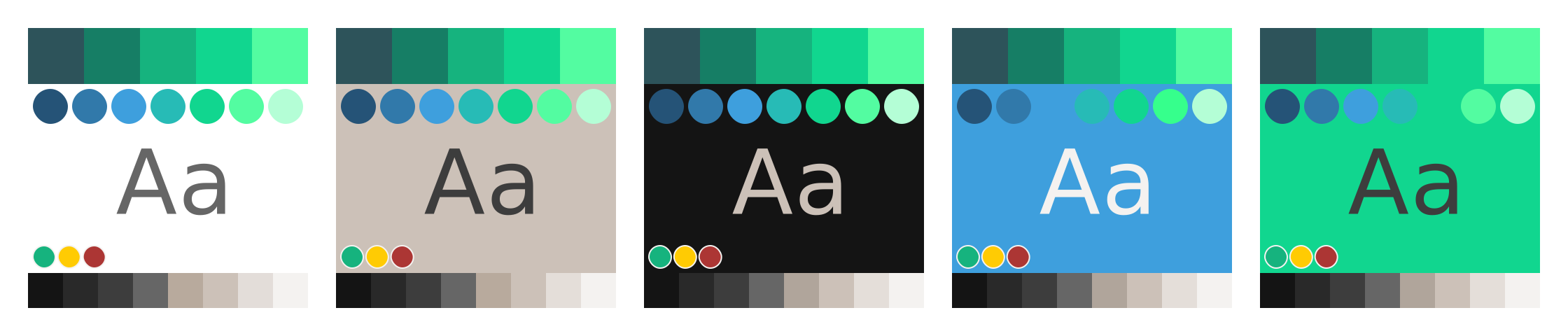
Pastor–ish inherits Boxen’s overall color system, but prioritizes colors differently from the parent brand. Notably, the green accent is omitted.
Spacing
(Coming Soon…)
Radius
- Images include a “small” border radius: 0.125rem.
- Buttons and form elements include a “medium” border radius: 0.25rem.
/* WordPress Presets */
--wp--custom--radius--small: 0.125rem;
--wp--custom--radius--medium: 0.25rem;
--wp--custom--radius--full: 50%;
Imagery
Minimalism
Ideally, the site will focus on typography and use minimal, iconographic images.





-
What is the purpose of “optical weights” (display, subhead, text, caption), anyway?
As text gets bigger, it looks darker. Or, as text gets smaller, it looks lighter. In printed book design, the goal of optical weights was to balance the “weight” (or darkness) of text on a page. The “Display” weight — intended for titles — is thinner/crisper. It is intended for larger text. “Subhead” is the next step down … then “Text” … then “Caption.” When optical weights are used together, text at different sizes all feels the same weight.
Two changes in digital typography have altered that original goal. The first change is technological. Each of those optical weights is a different font file, and downloading all of those files slows page loading speeds. Nobody wants to wait those extra milliseconds. Waiting is considered poor user experience and comes with SEO penalties. On the other hand, we keep adding bigger and bigger images or even videos to our websites because we value those additions enough to justify the “cost” in loading speed.
The second change in digital typography is more subjective, but gets to the reason why we don’t value those optical weights enough to justify their “cost.” As noted, the original goal in printed typesetting was to balance the “weight” (i.e. darkness) of text so that it all felt consistent. It was considered poor design if the text on a page had different visual weight. As more and more people gained access to simplified layout tools (from Microsoft Publisher to Canva) and did not need to hire professional designers for their layout needs, that original standard of quality has been lost … or evolved (depending on your perspective). “Regular folk” just don’t care about balancing optical weights. In fact, most people like to hit bold and change the color … maybe even make it italic and swap out the font. Non-designers like to see a lot of change and contrast on the page. As that becomes increasingly normal, many designers have also adapted their standards.
Using multiple optical weights, then, “costs” extra loading time and doesn’t align with the design values of the masses who haven’t been trained to value a specific standard tied to print design. Therefore, we typically only select and use one of those optical weights rather than using them together. This site is set in “Minion 3 Caption,” because I specifically chose the heavier weight as my base “font.” In contemporary digital typography, selecting a specific optical weight amounts to the same thing as selecting a different font.
↩ - “Humanist” typefaces inherit properties from how the human hand holds tools like a chisel, brush, or pen. “Grotesque” and “Geometric” typefaces that dominate earlier modernism drew their inspiration from pure geometry, intentionally avoiding those “human” qualities. Learn More (Wiki)
- I selected the Golden Ratio partly because it is beloved by designers, and partly because it presented a unique challenge to implement. 1.618 isn’t the easiest ratio to scale by. I needed to really understand the math to use it properly. Learn More (Wiki)